
Project Statistics
How do I View My Project Statistics?
- To find the project statistics, go to the project home page.
- To see the Tag Distribution graph, it will be on the top of the project home page.
- To see the Advanced Statistics graph, it will be in the middle tab.
- The bottom of the page shows Neural Training Insights.
Overview Statistics
All of these statistics will update as you create annotations and train models. The left side of the Overview tab shows the main numerical statistics, such as how many assets you have, how many are annotated, how many annotations you have, and how many different class tags there are.
The right side of the Overview tab contains visual aids with more detailed analysis of your dataset. There are two tabs.
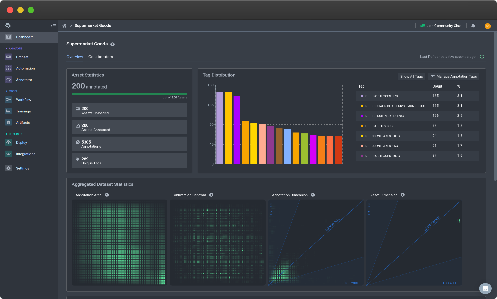
Overview of Project Statistics
Tag Distribution
The first tab is the Tag Distribution which is a bar graph displaying the number of annotations for each annotation. This is an easy and great way to indicate any training dataset class imbalances that you might want to rectify.
This can be used to either suggest whether you need to add more examples to your underrepresented classes, or some how artificially add to it by taking using augmentations to add examples into your pre-existing images.
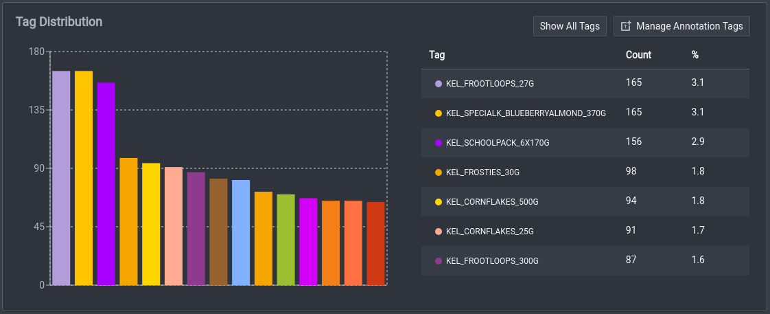
Tag Distribution Panel
Aggregated Dataset Statistics
The other tab contains the Aggregated Dataset Statistics tab. This is a way to provide more nuanced understanding of your dataset in a few significant ways. The granularity of the advanced statistics better reveal the distribution of your annotations in not just categorical ways, that allow for relative comparisons in aspects such as the spatial distribution.
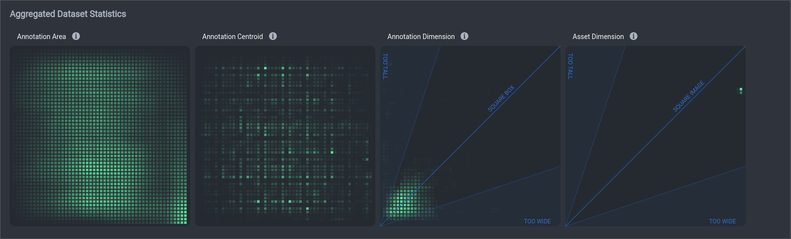
Aggregated Dataset Statistics Panel
As of now, they consist of four heat maps that provide a visual way to interpret your data. These four heat maps are the Box Area, Box Centroids, Box Dimensions, and Asset Dimensions. These heat maps provide the visual ease of analyzing your data qualitatively, and also providing valuable information that show you necessary changes.
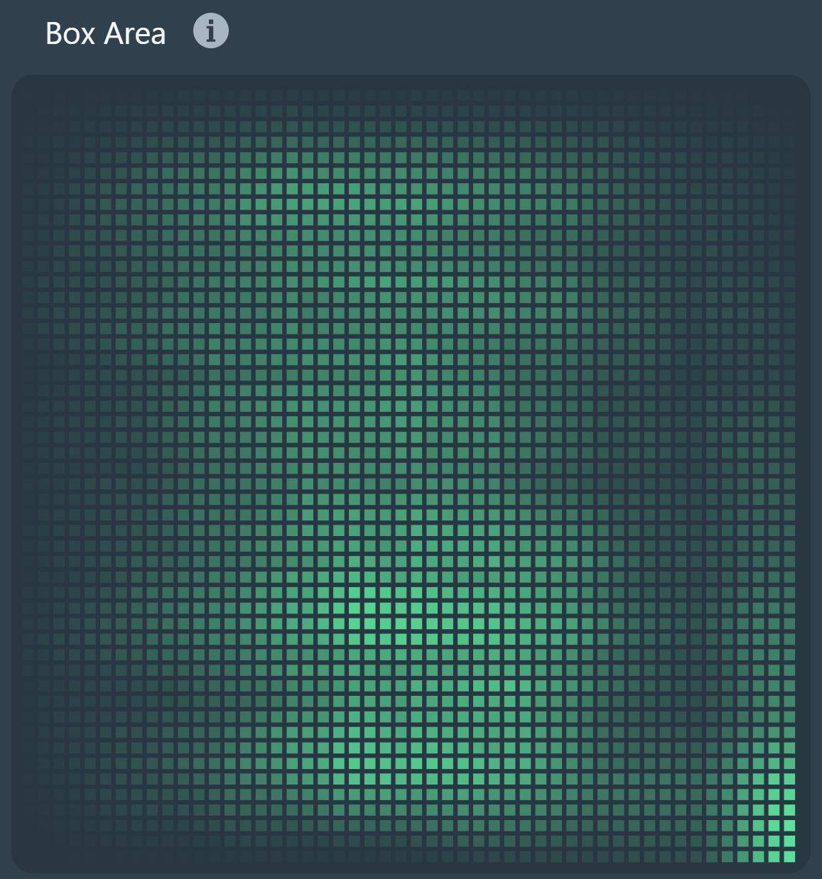
Box AreaThis graph shows the concentration of annotations in a localarea on an image based on normalized coordinates. This can show you where most of your annotations are in an image and how you might be able to benefit from positional augmentations. |
|
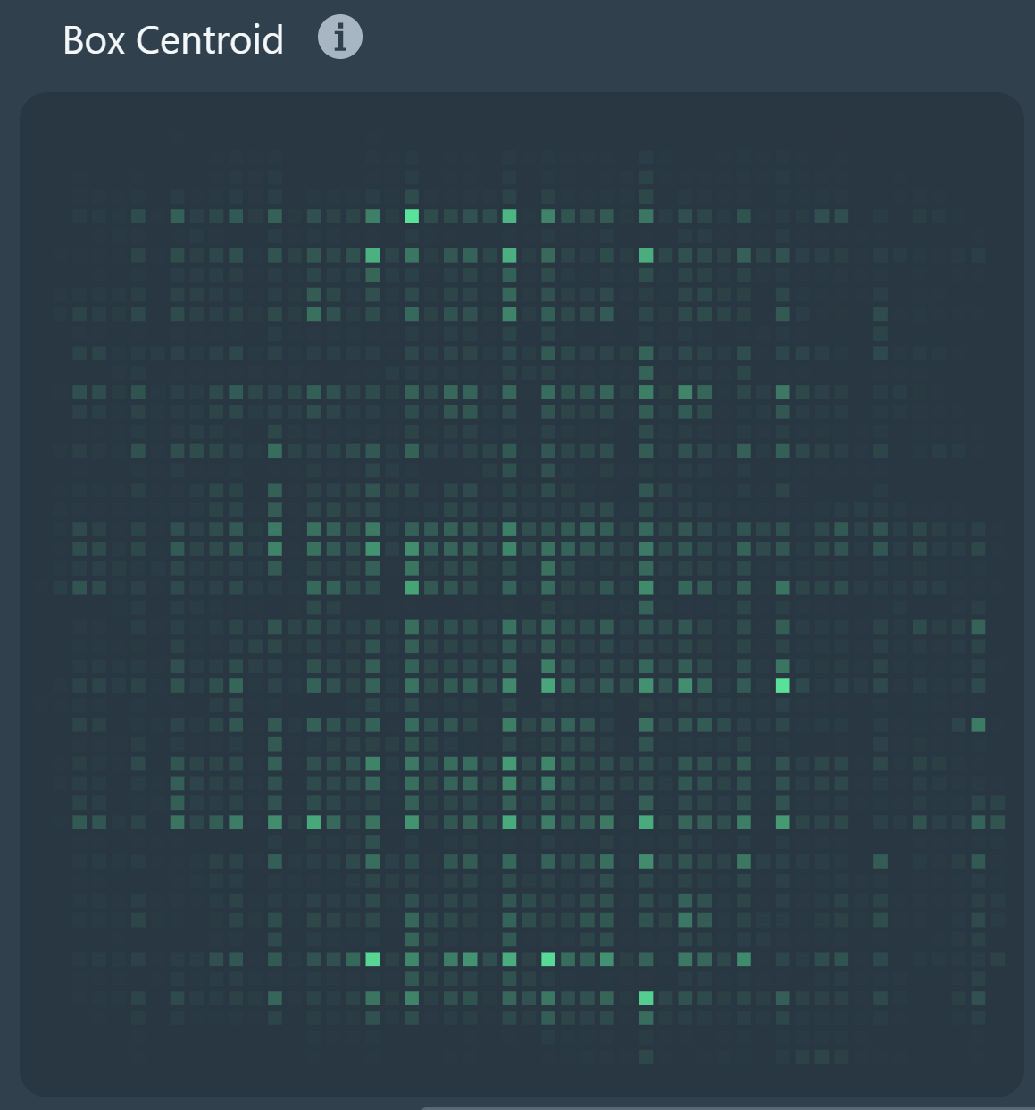
Box CentroidsThis graph shows the concentration of annotation locationbased on their centroids on an image. Similarly, this is a more visually distinct graph for where annotations are mainly centered around. |
|
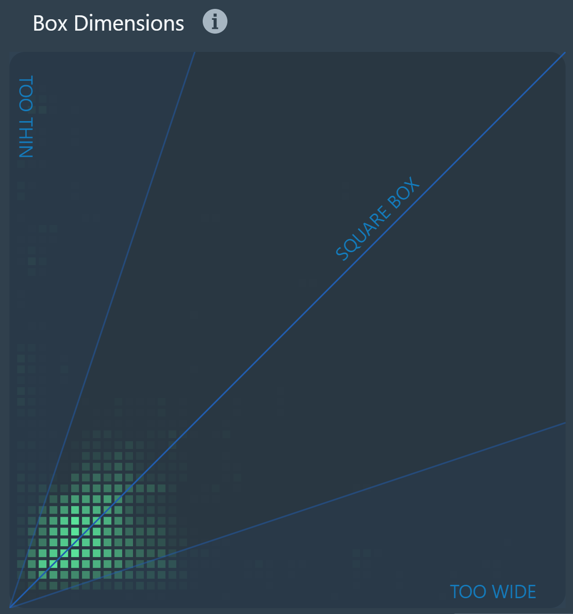
Box DimensionsThis graph shows the concentration of bounding box sizeswhich can be helpful way to see the distribution of your bounding box dimensions. This can encourage other types of positional augmentations to detect objects from more perspectives. It can also indicate the frequency of box dimensions that are dangerously imbalanced in size. When box dimensions are too imbalanced, the dimensions can worsen the capability of the model in predicting those exact bounding boxes with high precision as corrections are one dimension are much more meaningful and precarious than the other. Thus, whenever it is possible contextually, one should aim to have more balanced box dimensions for easier and more achievable object detection. |
|
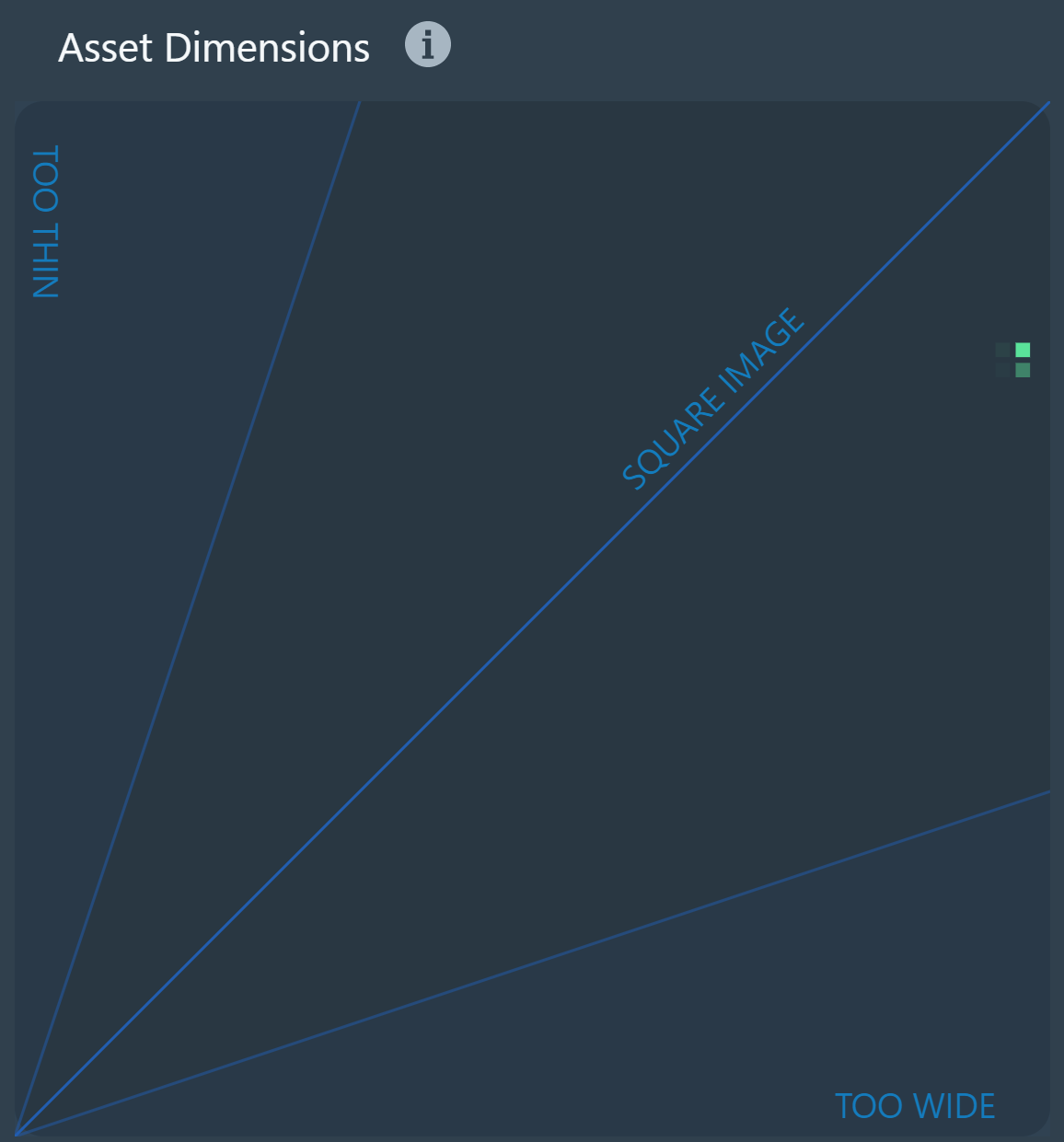
Asset DimensionsThis graph shows the concentration of asset dimensionswhich can be helpful way to see the distribution of your asset dimensions. Because computer vision models take square images as inputs, during the training, preprocessing images to match the correct dimensions is necessary, so if your images are overly rectangular, information can be lost in this step. Thus, this can elucidate the necessity to do further preprocessing before uploading the assets to the platform for training and annotating. |
|
Extreme cases indicated on the heat maps, such as lack of uniformity in box area and box centroids or high levels of concentration along the edges of box and asset dimensions can lead to negative effects on model training performance. You should keep an eye out as you continue to add assets and annotations to your dataset.
Overall, these heat maps can serve as an easy yet detailed visual reference for better understanding nuances in your dataset that can have real effects on the model training and performance. Further along the roadmap, we will also be introducing more integration between the information on these heat maps and advice that we might have to help you improve performance based on what is being collected on the heat maps, such as useful data augmentation techniques or other customizations.
Neural Training Insights
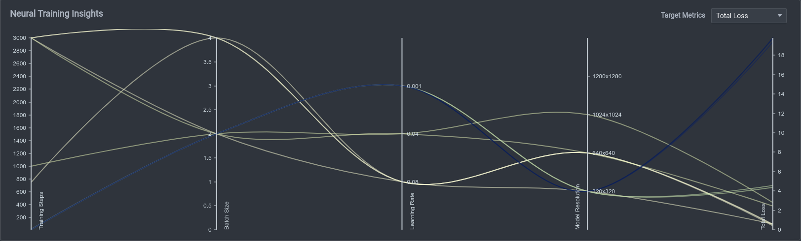
Neural training insights provide ways to easily compare and analyze different training runs based on your different settings, such as Training Steps, Batch Size, Learning Rate, Model Resolution, and Total Loss. You can see what other combination of settings you might like to try to gain better results, and it is a generally easy plot to show the variety of trainings.
Neural Training Insights Panel
Overall, these project statistics provide a fairly holistic overview of the project, from the details about the assets themselves, aspects of the annotations made on top of the assets, and even results of the training process as well. Thus, just by looking through the homepage, you can get a cohesive view over the project as a whole and the progress that you are making from start to finish.
Status History Statistics
Annotation is a large part of a machine learning project. This Sankey chart shows the overall flow of the transition of image statuses throughout the process, from unannotated, to annotated, to reviewed, and finally to completed. This can be a quick way for project managers to understand the progression of images and where the key limiting stages are. Below is an example of a Sankey chart you might be able to view in your own project.
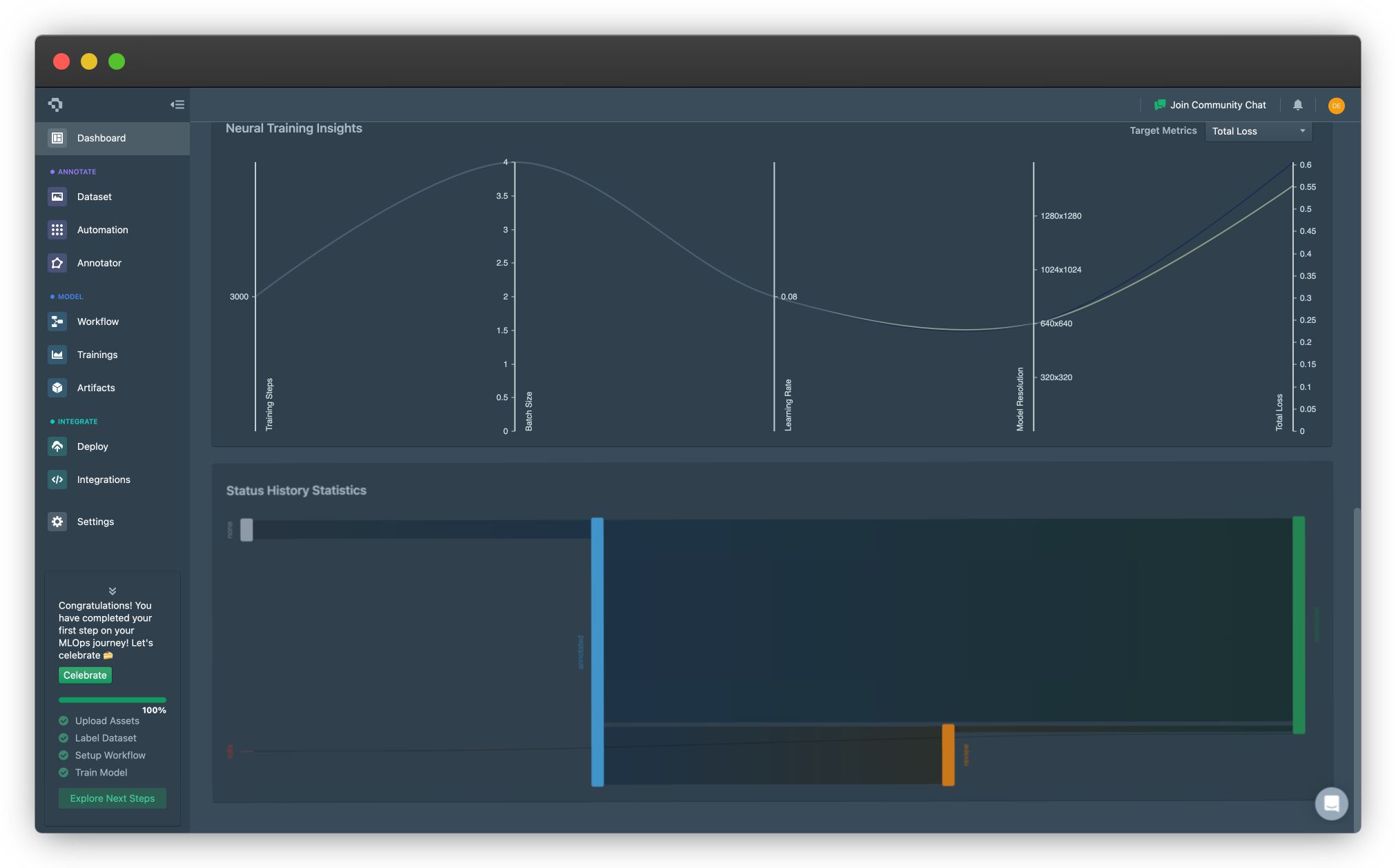
Example of Status History Statistics Sankey Chart (click on image to enlarge)
Common Questions
Do these statistics update in real-time?
Yes, the statistics and graphs update dynamically. If there seems to be an error, give it a refresh and it will update!
Will you continue adding statistics in the future?
Yes, if we see enough requests from users to warrant an addition, we will add it onto our platform. If you have such a request, please feel free to contact us!
👋 Need help? Contact us via website or email
🚀 Join our Slack Community
💻 For more resources: Blog | GitHub | Tutorial Page
🛠️ Need Technical Assistance? Connect with Datature Experts or chat with us via the chat button below 👇
Updated 10 months ago